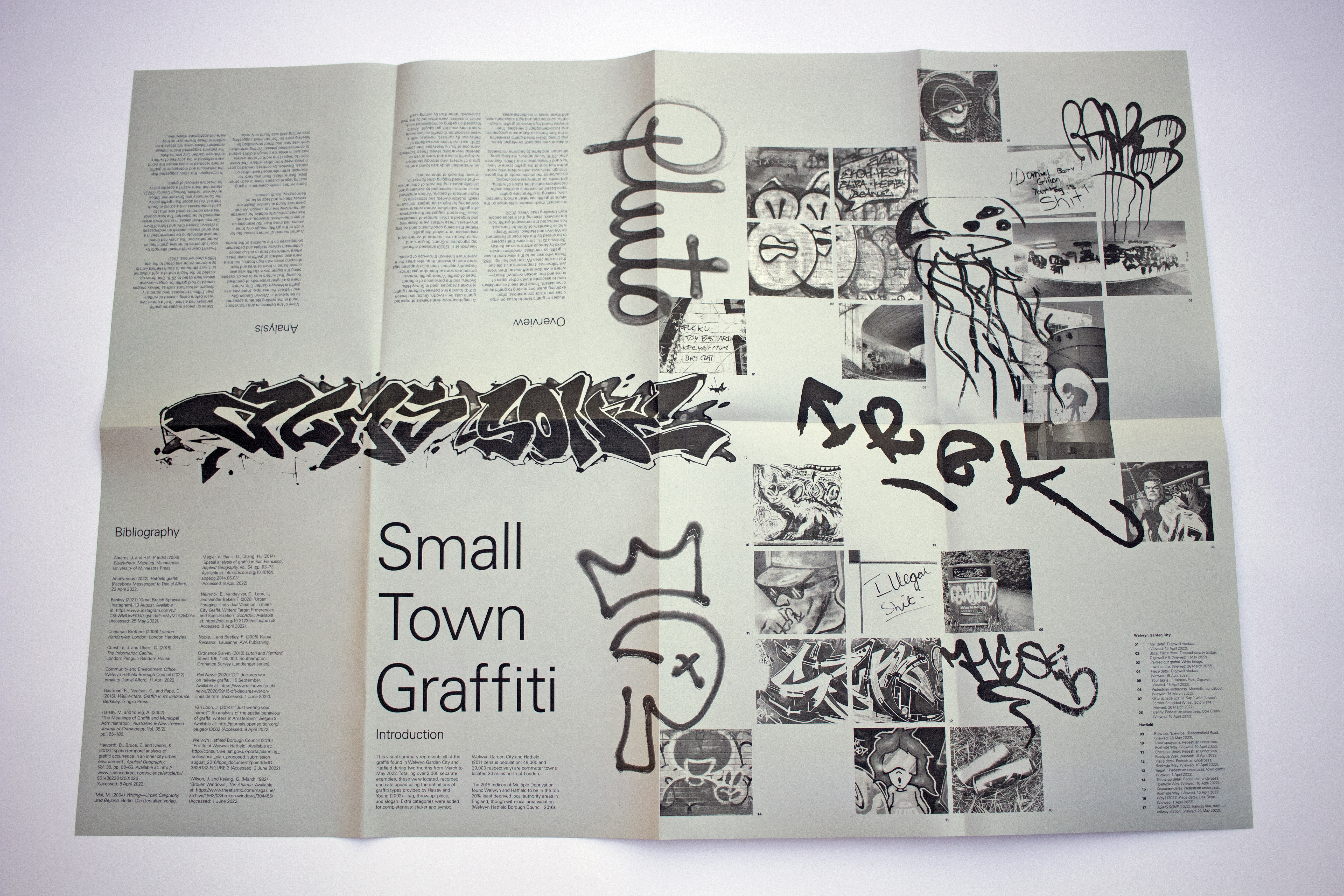
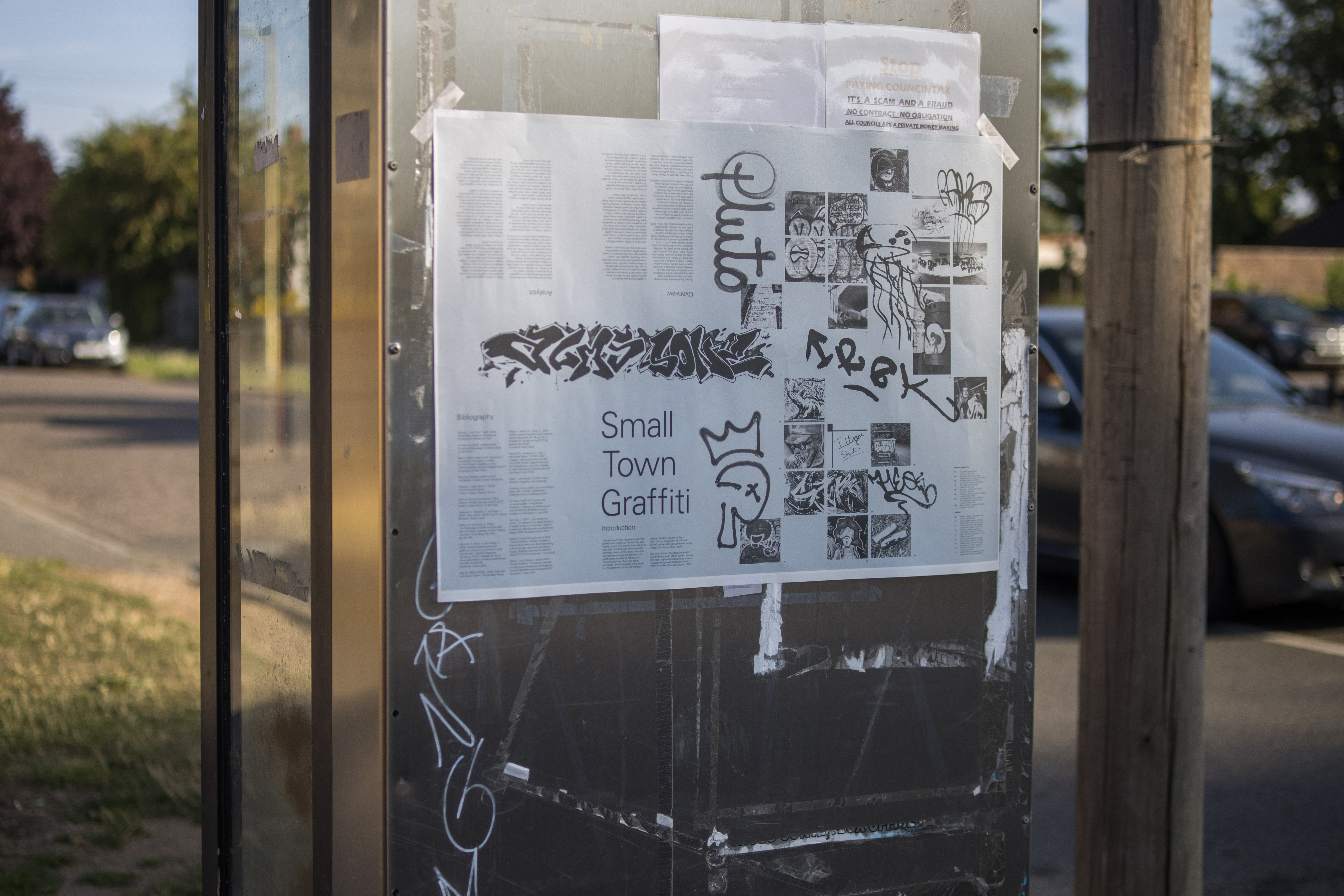
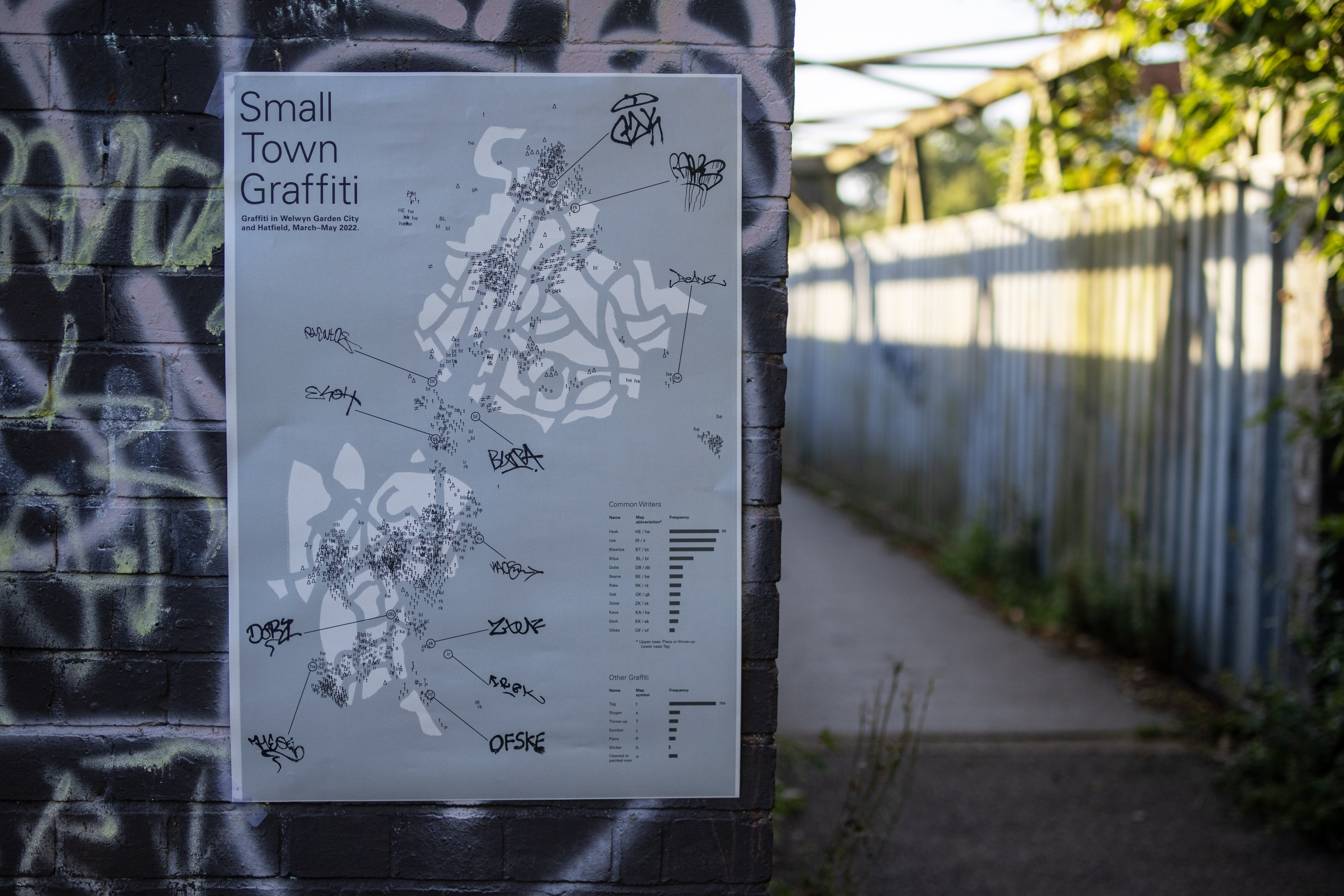
Small Town Graffiti
Information design
Data visualization
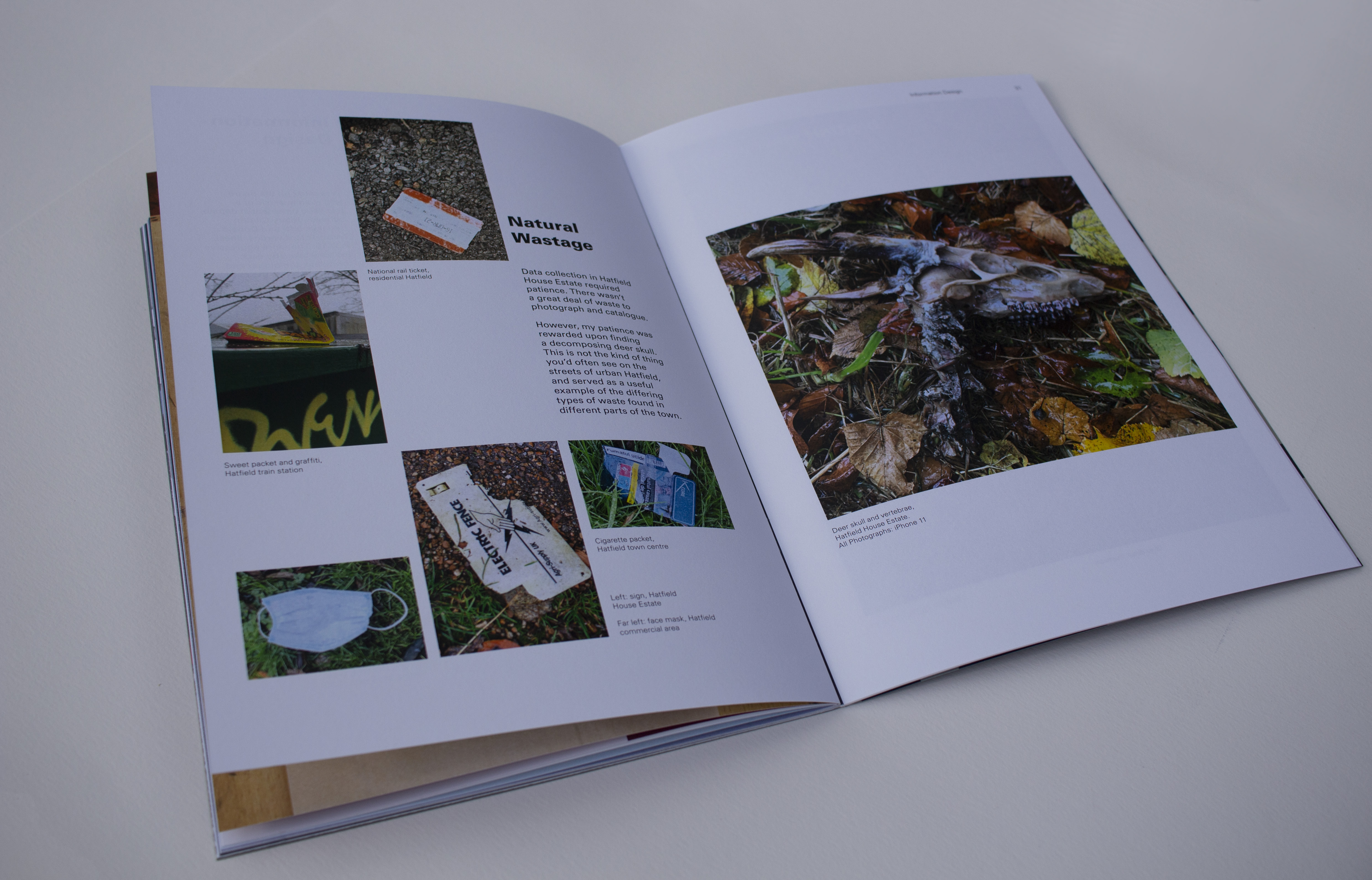
Arguments about graffiti as vandalism or art tend to reference the extremes of good and bad, often found in major urban environments. In the (not so urban) towns of Welwyn Garden City and Hatfield, I found graffiti to be about social interaction — of conversation, argument, politics, and prejudice. Graffiti is a record of life on (any) surface.


Visual Summary
Layout
Book design
A summary of work undertaken during the first half of my studies for the Post Graduate Certificate Design for Visual Communication at the University of the Arts, London. The 40-page booklet catalogued preparatory and developmental work, as well as submitted pieces and sources of inspiration.


Mountains,
Tall and Small
Illustration
Layout
Information design
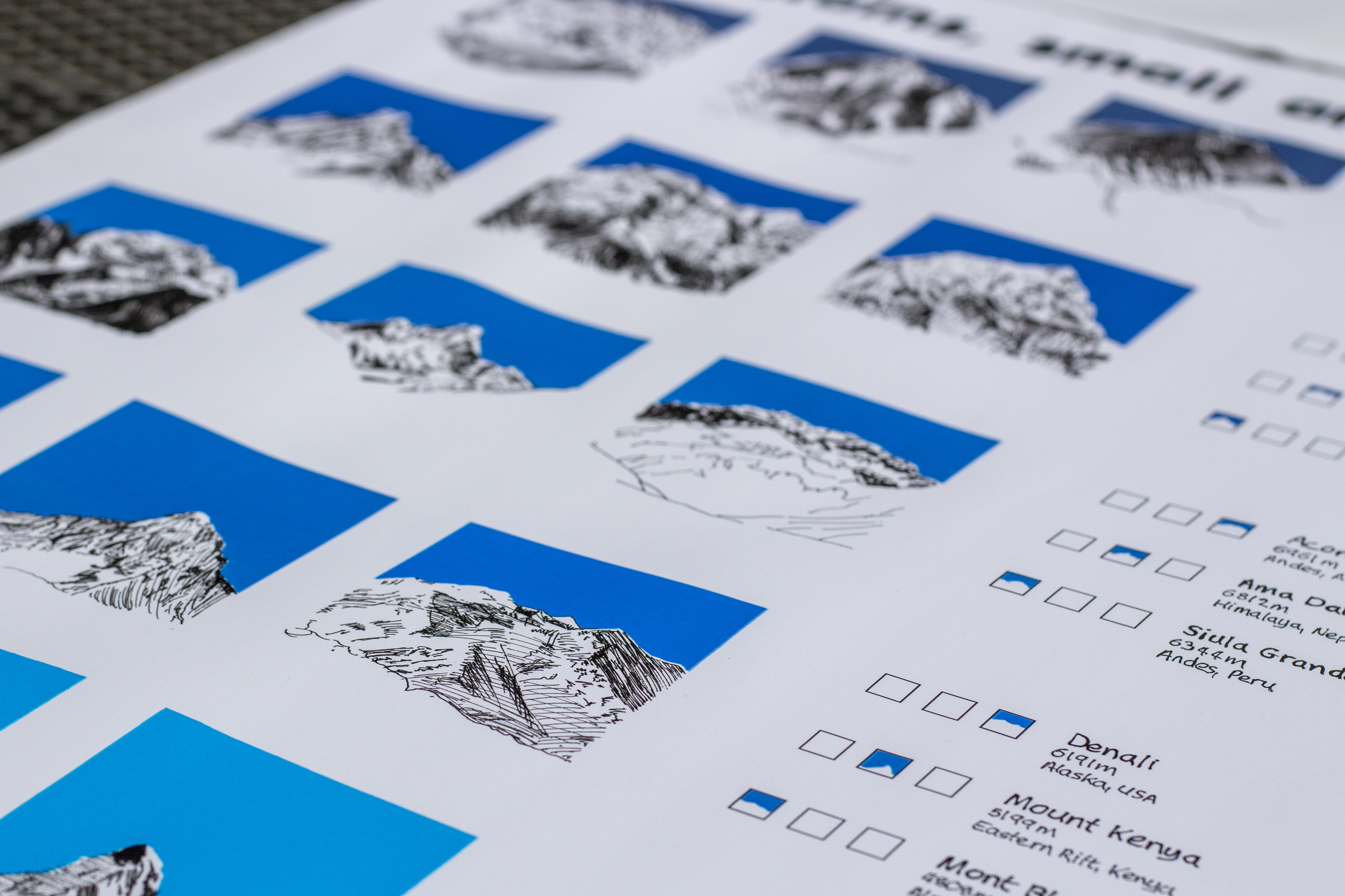
Mountains, Tall and Small was a personal project to present the shapes of a range of mountains and the comparative height of each peak. Freehand sketching conveys the organic nature of the subject and accentuates selective details of each mountain.

Type
Typography
To design a display typeface and cover of a magazine I sourced a Futura Bold 60pt metal letterpress typeface, dipped each character in acrylic paint and photographed them. The result was a typeface fusing the crispiness of a classic san serif typeface with organic, patterns and texture of something handmade.
The feature for the magazine cover was a Futura Bold questionmark. The questionmark was photographed suspended by cord and subject to directional light to cast a shadow against the wall behind.
The feature for the magazine cover was a Futura Bold questionmark. The questionmark was photographed suspended by cord and subject to directional light to cast a shadow against the wall behind.


COVID-Aware Messaging
Information design
Branding
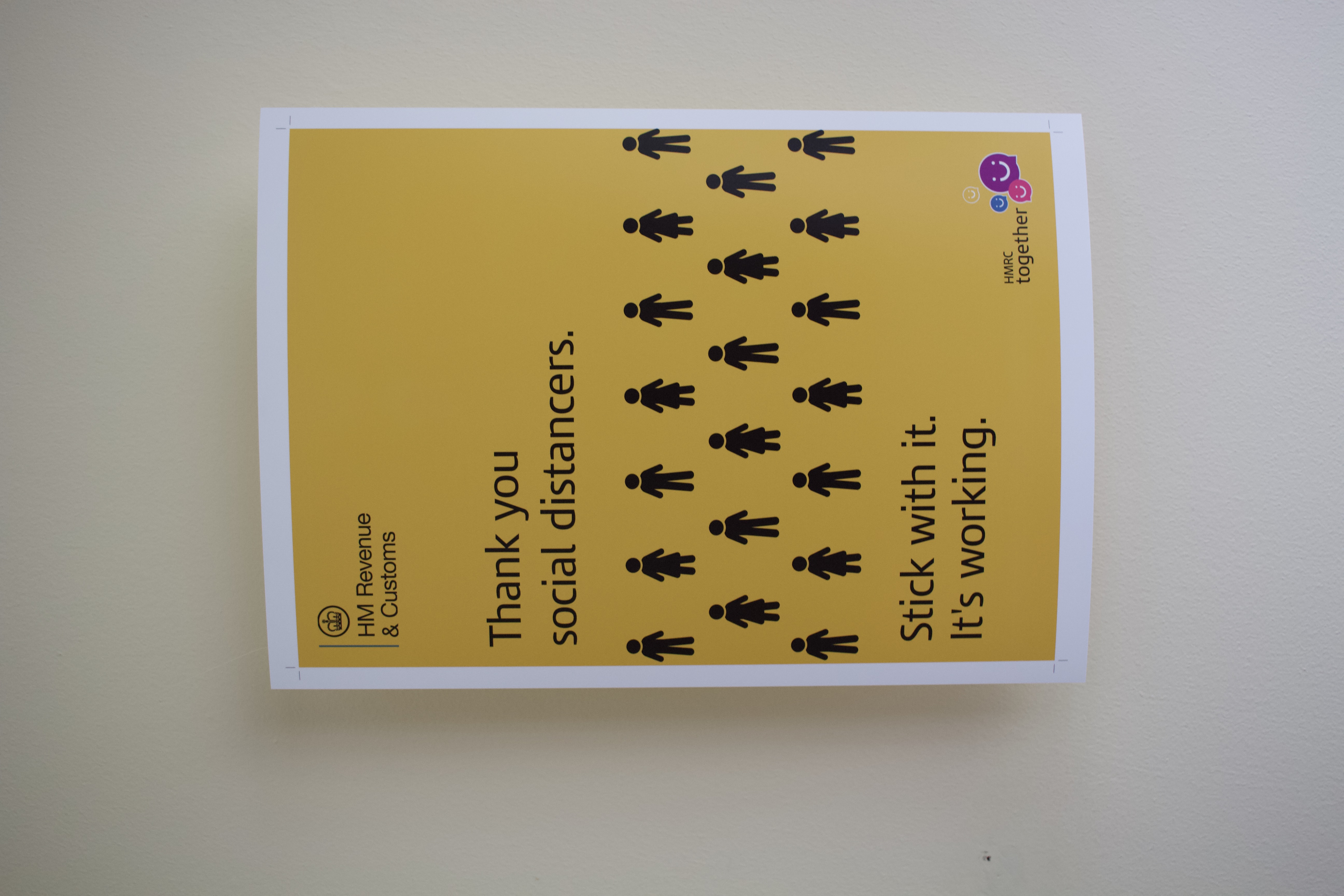
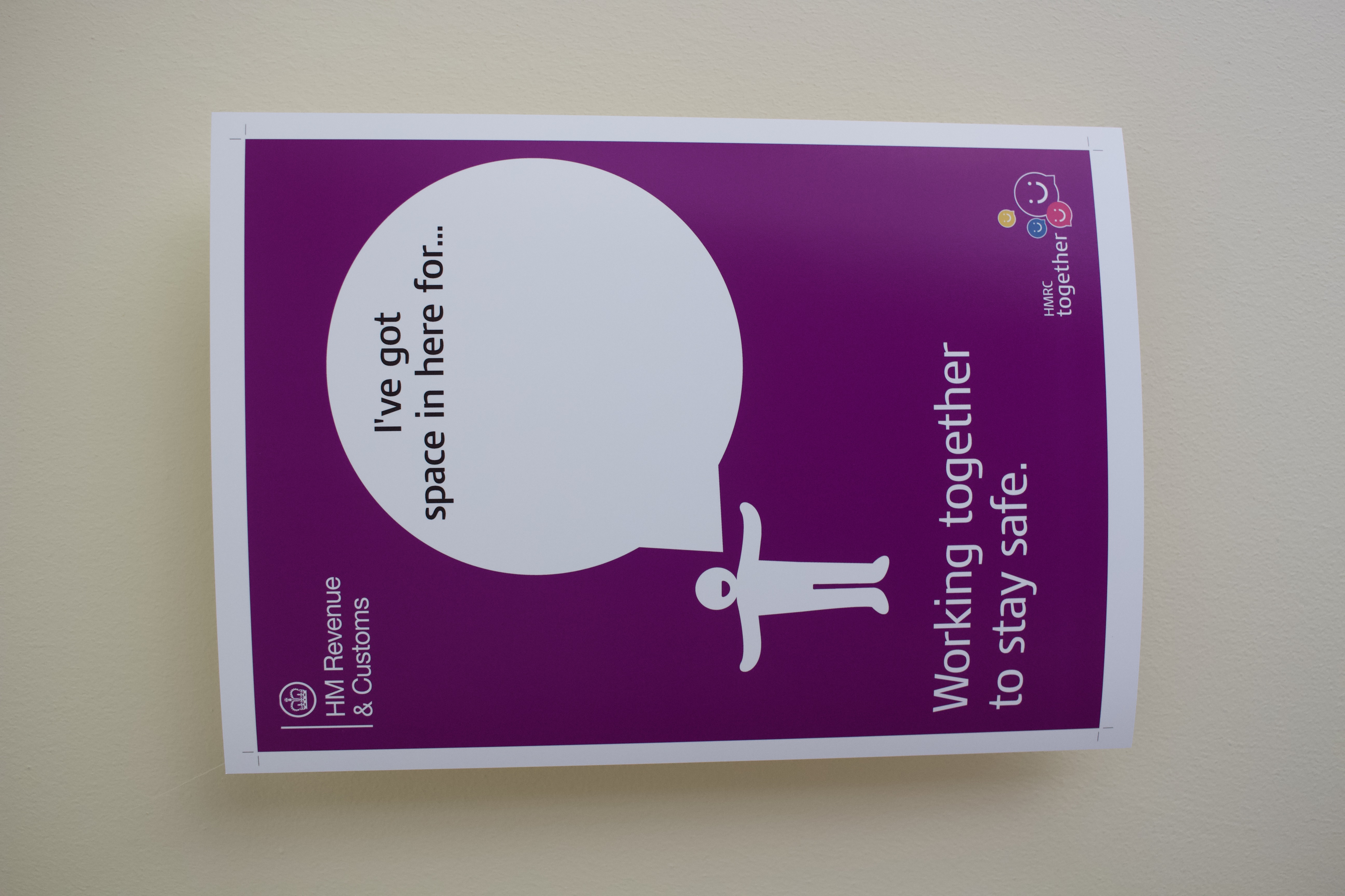
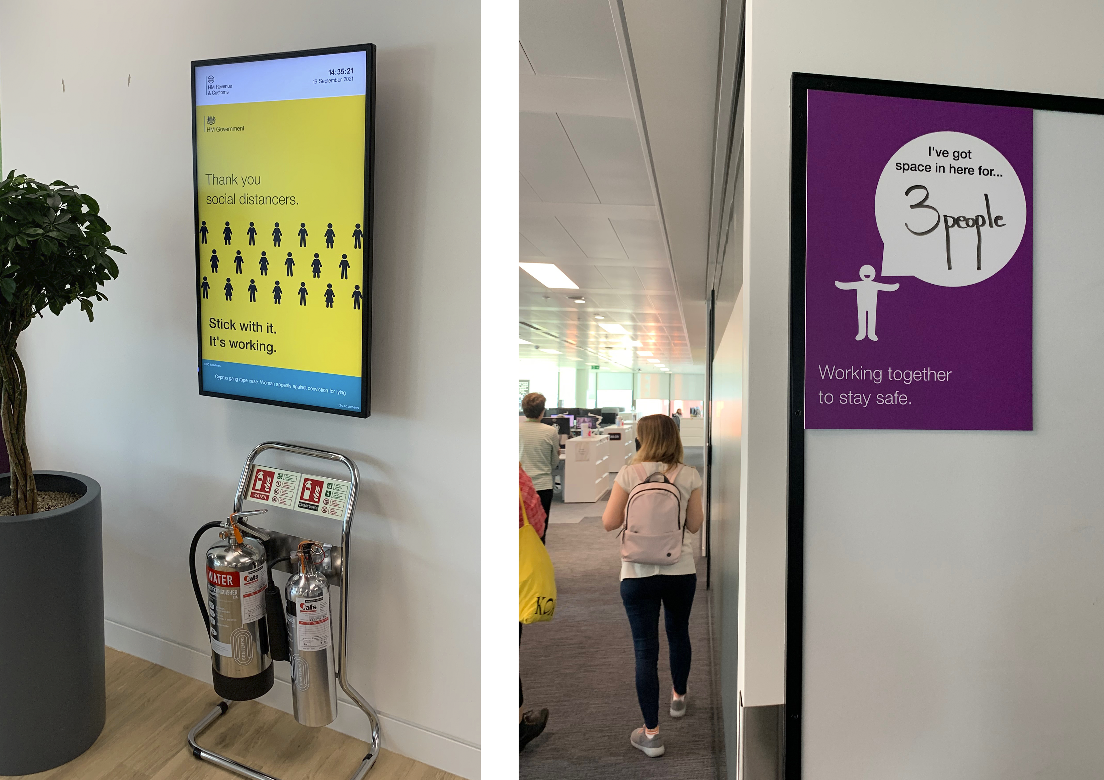
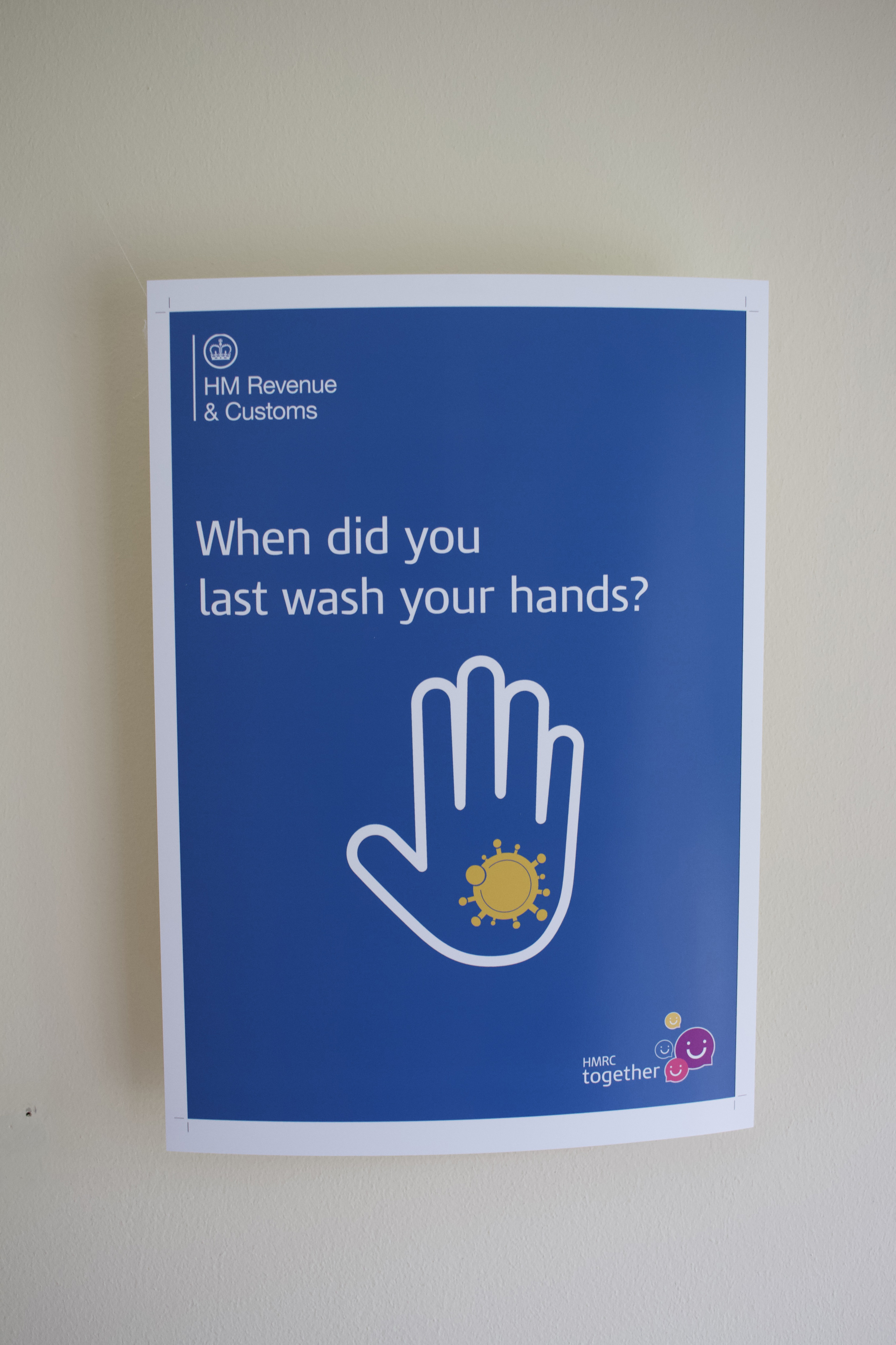
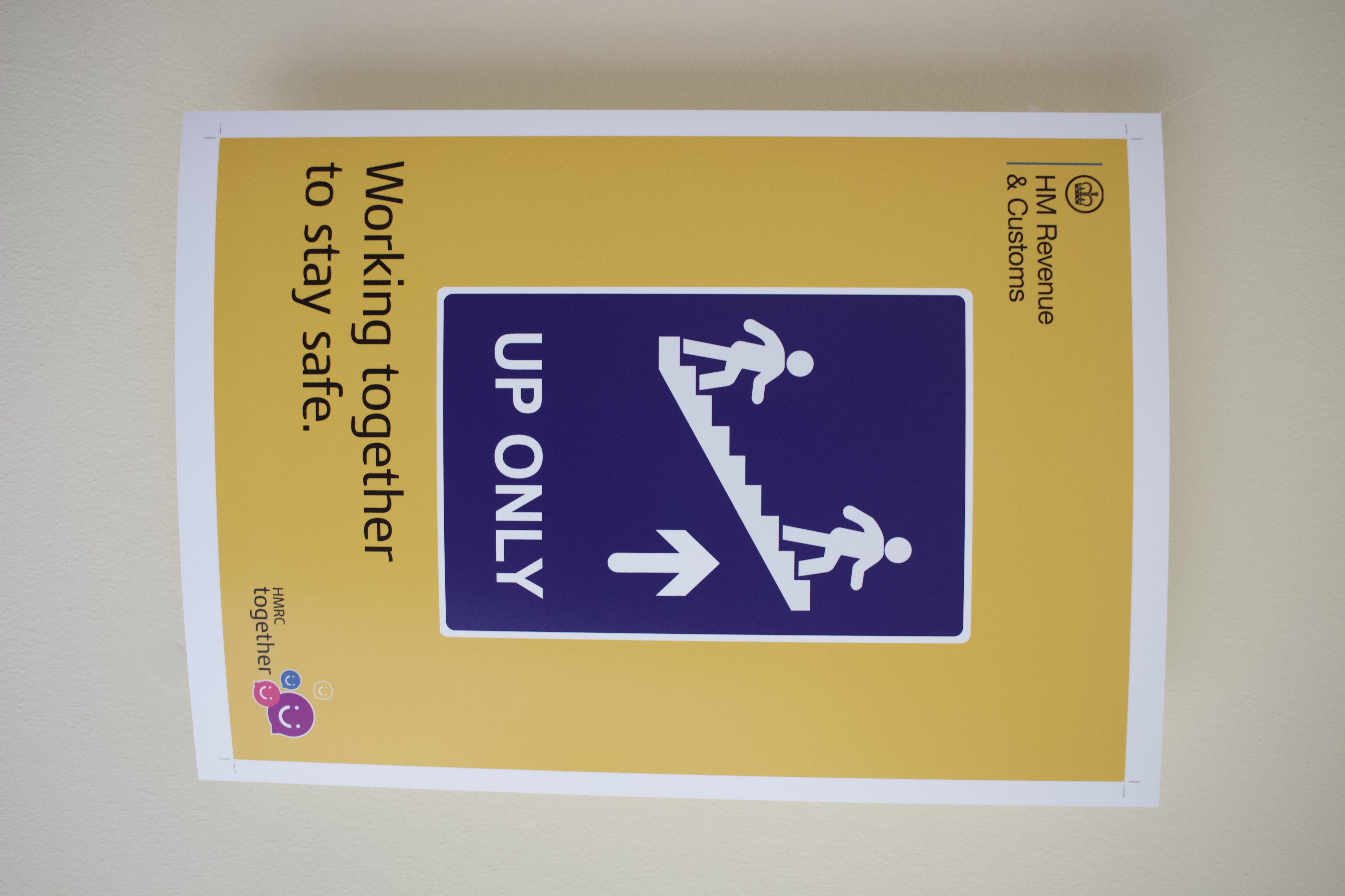
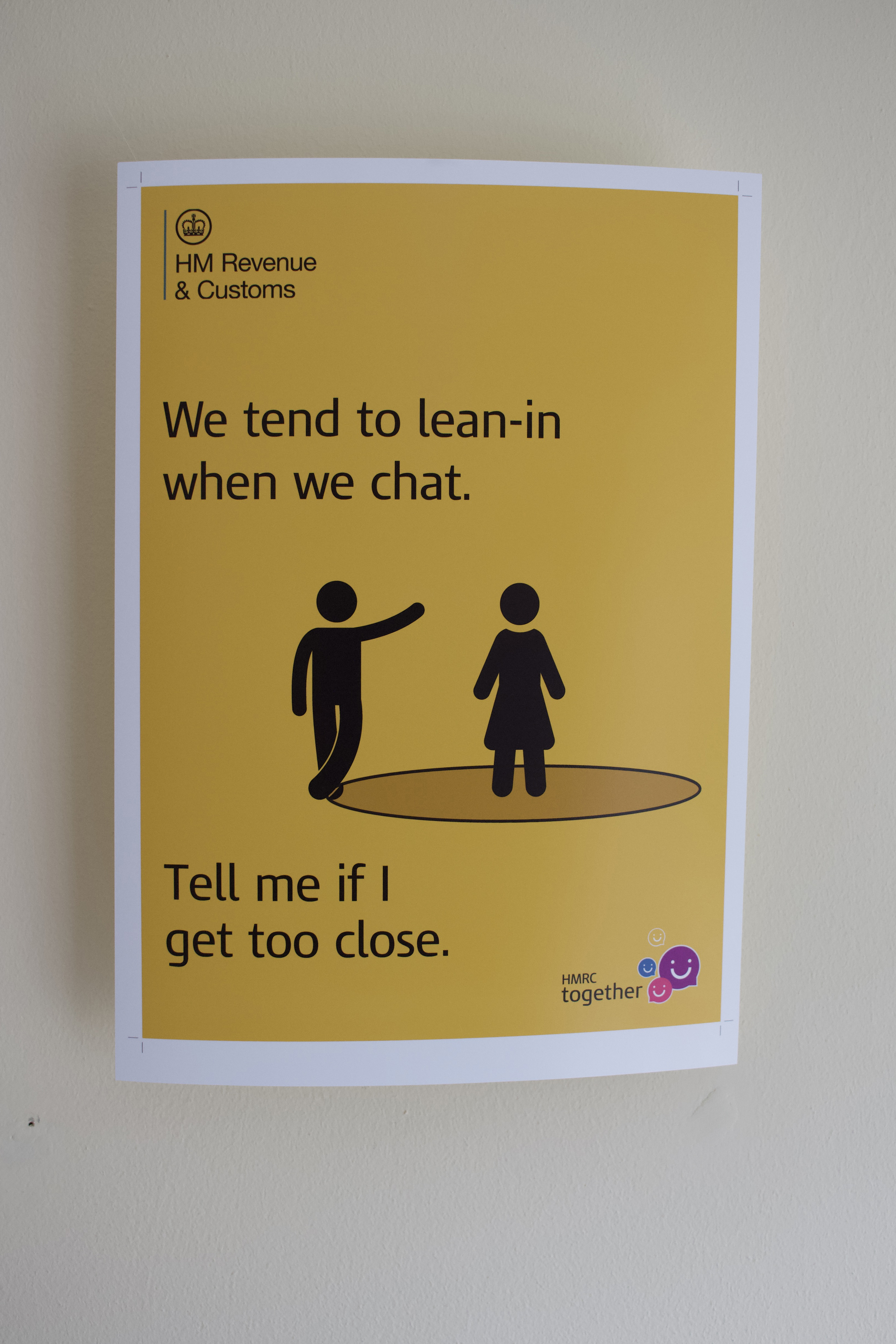
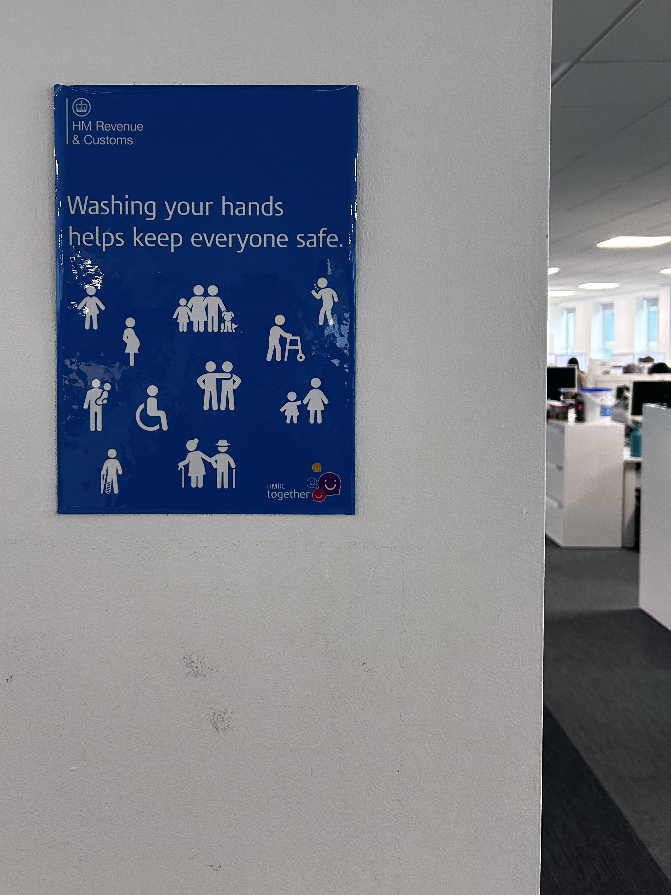
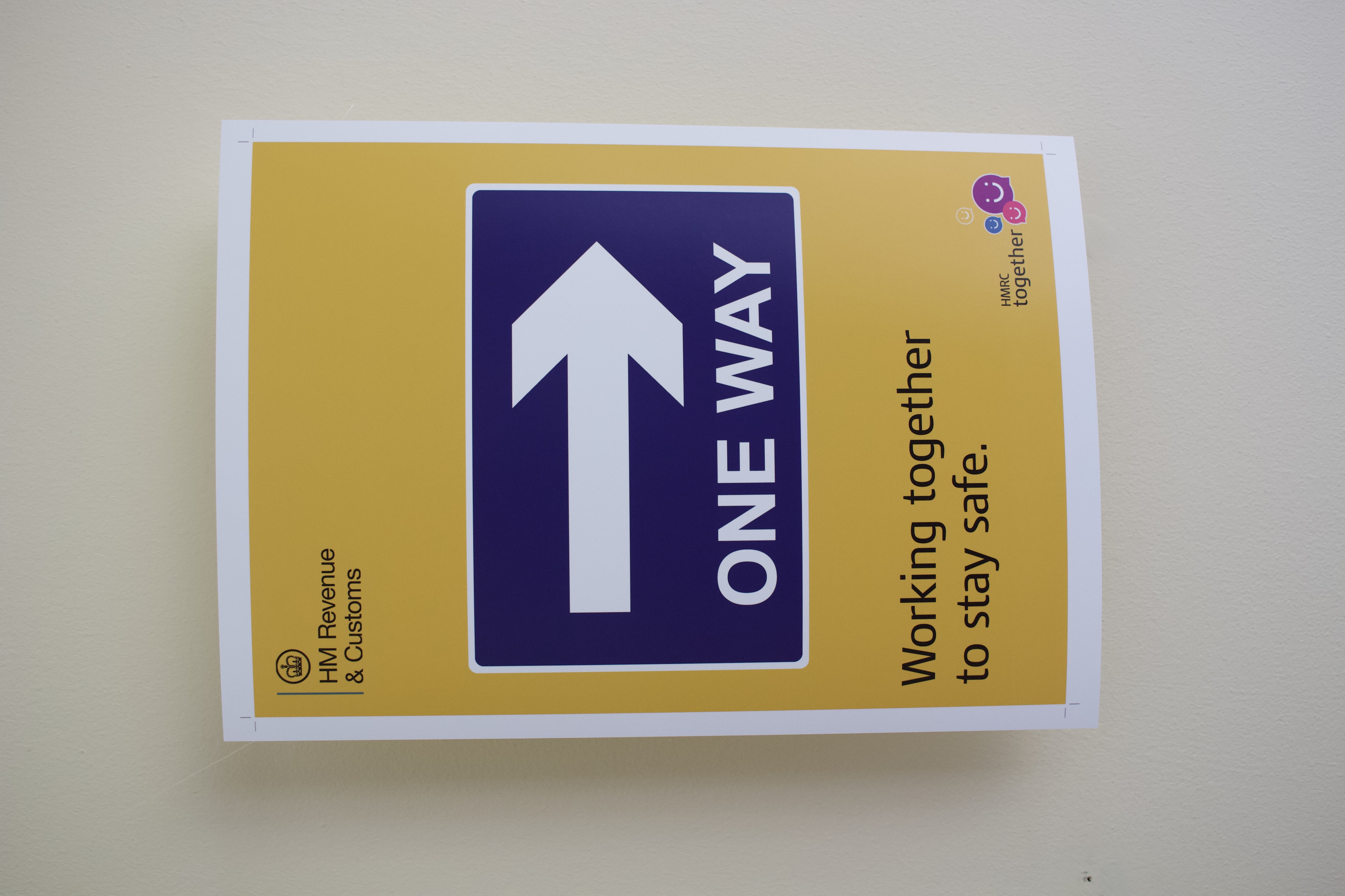
I designed posters and other materials to encourage COVID-aware behaviour in government buildings. These were iteratively developed following user testing and piloting. Instructional messaging, such as ‘wash your hands’ was considered patronising by users but motivational (“stick with it, it’s working’) or thought provoking messages (“when did you last wash your hands?”) were found to be effective at encouraging behaviour.
The posters used full colour backgrounds to maximise contrast against walls. Simple designs contained limited messaging that could be understood at a glance by people passing by.
Whilst corporate style guides were avoided in favour of a more disruptive style, colour palettes and corporate typefaces were retained to provide authority.